
“Human subtlety sill never devise an invention more beautiful, more simple or more direct than does nature because in her inventions nothing is lacking, and nothing is superfluous.” Leonardo da Vinci.

On the 18th September I will be giving my first live workshop since lock down at THE INSPIRED HUB in Hampton http://www.theinspiredhub.co.uk
I first mentioned the inspired hub two months ago on this blog in a post entitled ‘CREATIVE THINKING, PERSONAL WELLBEING AND COMMUNITY.’ The HUB is proving to be a wonderful addition to the Hampton (SW London) community.
Using watercolour, and beginning with playful exercises the workshop will focus on spontaneous painting and loosening up.
Watercolour is a beautiful medium. There are a few basic techniques to learn – each one taking time and patience to master. Allowing ourselves to play with the medium will help build confidence and ability.
In this instance I have sketched out two cala lilies – using yellow ochre. I am working on a Saunders and Waterford Hot Pressed – heavy paper. (more about papers at end of blog)
 Having sketched the basic image I add ‘juicy tube paint’ into the negative space (the area surrounding the lilies). I am using a mix of Daniel Smith Perylene Maroon with Winsor & Newton Winsor Violet and a little Winsor & Newton Cadmium Orange.
When we add paint to the negative space – we automatically reveal the subject….. Using very small amounts of pigment I begin to add colour to the lily. For this I use Winsor & Newton Green Gold and a touch of Windsor & Newton Cadmium yellow. For the dark green in stem and shadow I mix some Winsor & Newton Burnt Sienna with a tiny amount of prussian blue and Gold Green.
All the whites are dry white paper.
 I begin to build depth inside the lily using small amounts of pigment – making sure to leave dry white paper for highlights.
  As I build up the colour I am mindful of bringing the background colours into the Lilies. Everything is connected….nothing is isolated. By moving colour around a painting we bring a sense of harmony and rhythm.
It is important to note, that when we change one fraction of a painting – (no matter what the size) we change the whole. This is true for everything in life.  The finished watercolour is an observational exercise revealing the subtlety of nature….. and at the same time honing watercolour technique. I hope that there is an element of energy and movement. The most important thing is to PLAY and warm up. This can be done on any paper including newspaper…..The key is to release any fears or anxiety about messing up a good piece of paper. Ultimately this is a freeing up mechanism.
When purchasing watercolour paper – it is measured by weight and surface quality….Cold Pressed for rougher surface. NOT (meaning not hot pressed) is smoother and Hot Pressed is very smooth. My analogy is that using cold pressed is like roller skating and hot pressed like ice skating – NOT is somewhere in the middle.
When we purchase a piece of lb140 weight paper – this simply means that the ream of paper (500 sheets) weighs lb140 – and of course the same applies for all weights. It’s a good idea to purchase a sample pack of papers.…and again PLAY.
Another example of where I have used strong colours in the negative space to reveal the image. After I add colour to the flowers – leaving dry white paper for my whites.

 For the second part of my trip I stayed in Ploeumeur – very close to Lorient in the Brittany Region.
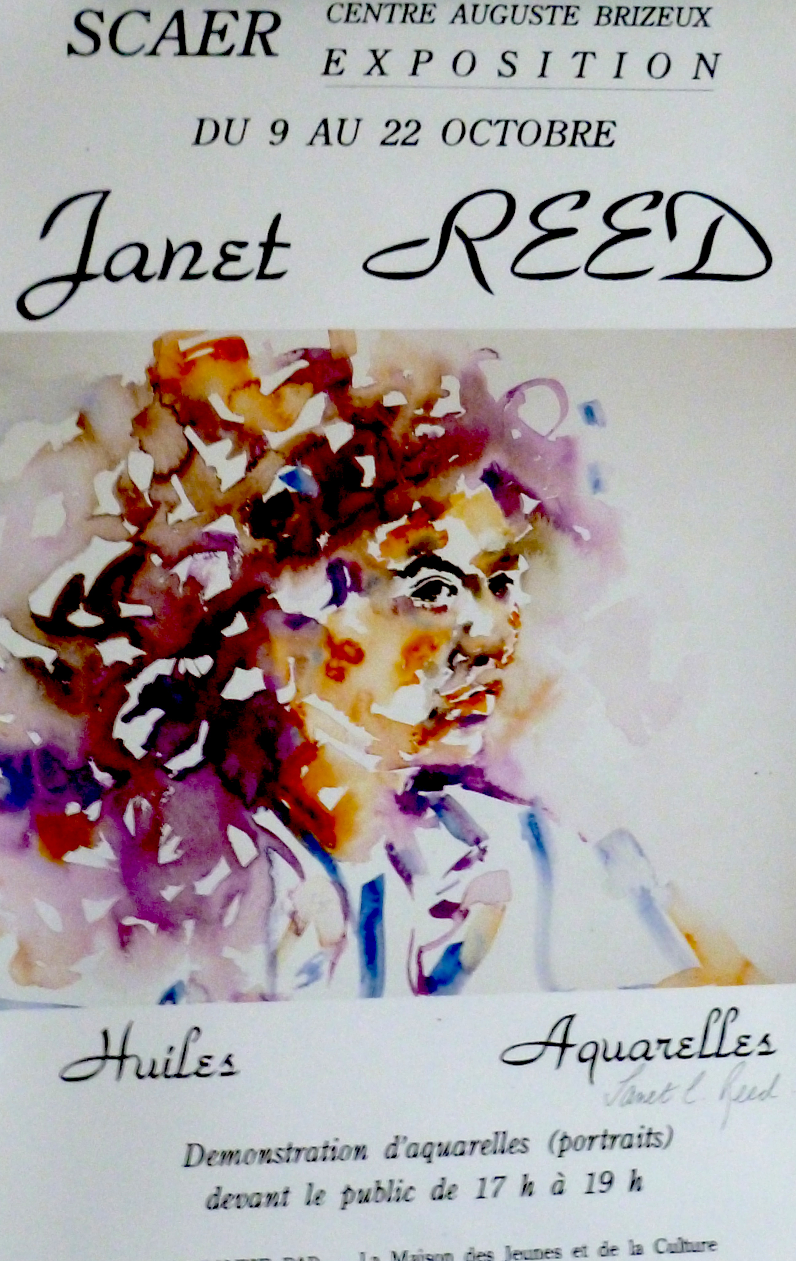 During this visit I stayed with my dear friend Elisabeth (Babeth), her lovely partner Erve and their beautiful little dog Nouchka:) I first met Elisabeth when she visited Crickhowell, Wales in 1993 – the year I arrived there….and we have been good friends since. Today she lives a minute’s walk from beautiful beaches…..and is very happy.
 And with Helene (Elisabeth’s sister-in-law) who I have also known for many years….such special friends
  It was through the 1995 exhibition that I realised how much I enjoyed painting people in a rapid watercolour style. I recognised that I captured through the portraits a moment in time…..and most importantly, I was able to connect with the people I met in a very special way.
  And beautiful Maelle – Elisabeth’s daughter – seventeen years old when I painted this and now a mother of two children and living in Vancouver.
  And dear Nicholas – who I saw on this visit (now in his mid thirties) and today resembling one of Cezanne’s self portraits. As I spoke with Nicholas I could still see the little boy in him.
 I have so many lovely stories about the people I have painted in many different countries. Often we don’t speak a common language, but painting like music becomes a Universal language – crossing all barriers.
 Another of her partner Erve – musician and all round good man. 2018
 Erve who is part of a Breton male choir ‘Les Gabiers d’Artimon’ – playing the Binjou – a bagpipe type instrument
 Erve leading a group on an exercise programme in the sea very close to where he and Elisabeth live. They do this no matter what the weather…
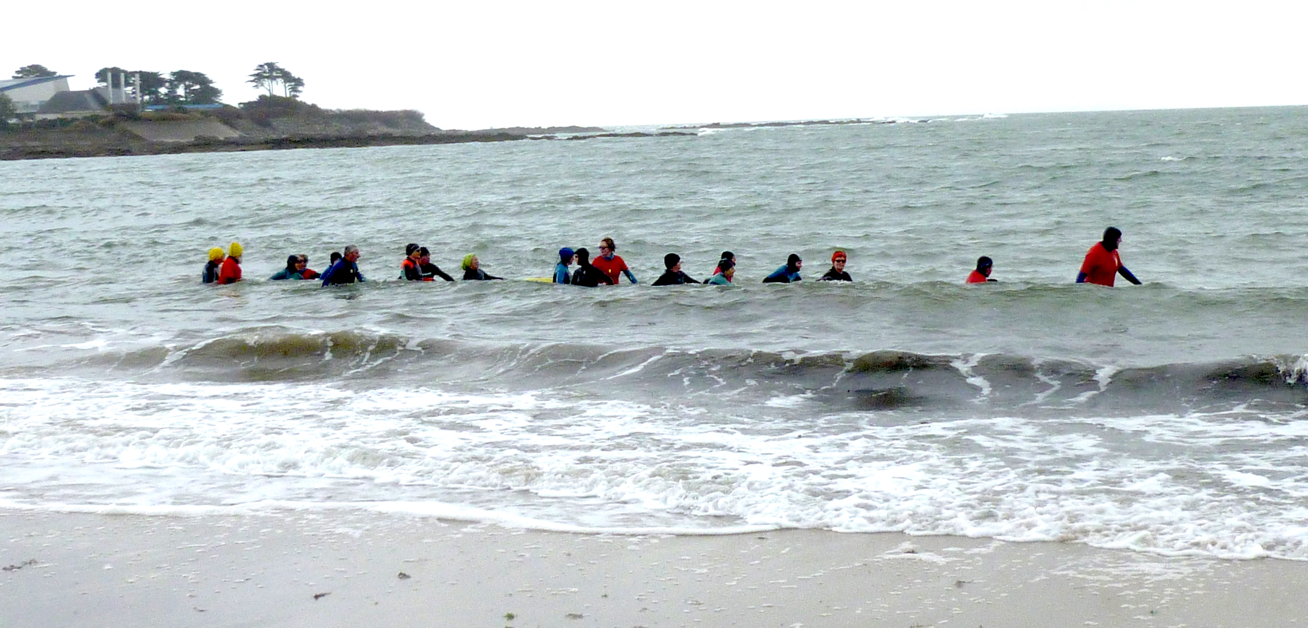 One of the many beautiful beaches that go on for miles and miles….
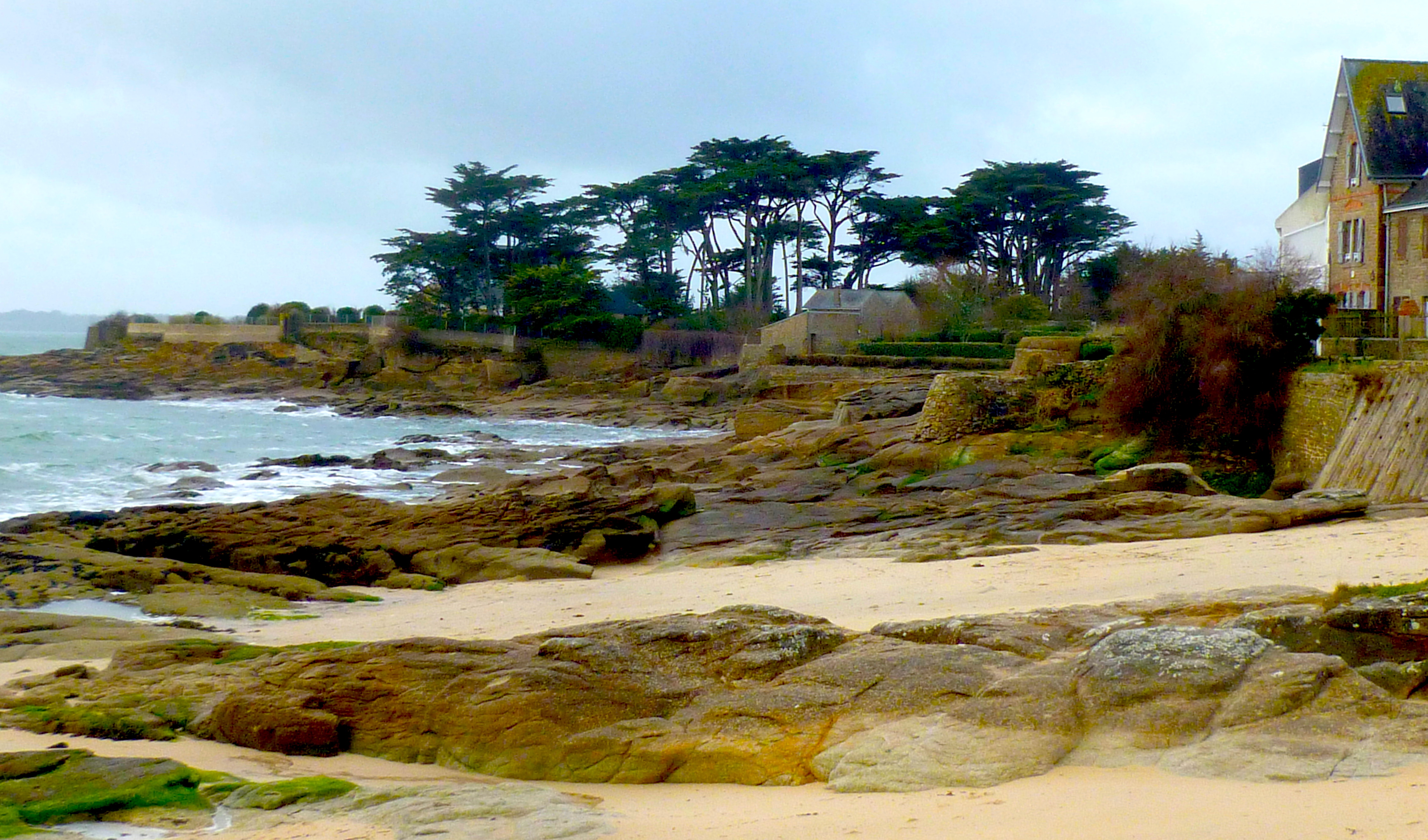 The Little Port of Doelan in Finistaire- where the French version of Doc Martin is filmed…..What a surprise that was ! Along with Nicole, a lovely friend of Elisabeth, we enjoyed a superb lunch and afterwards a walk along the cliffs.
  In visiting this region I am reminded that England and France were once geographically joined.…which is why parts of SW England (Cornwall and Devon) resemble so much of Brittany. Other than the fact that Brittany has better summers, the weather is also also similar.
 During my forty five year career I have experienced moments when I wondered how could I continue….how could I go on? This trip has reminded me of how fortunate I am to have lived the life I have – to have met so many wonderful people. To live the life of an artist.
 And of course a magical hummingbird – or Colibri Magique.….they were with me all the way.
 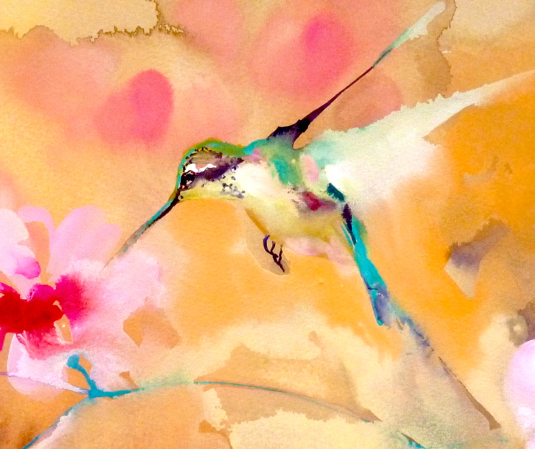 Wishing one and all a beautiful day and weekend ahead.
 New hummingbird products including some pretty nifty wrist watches in my Zazzle shop.


